


The arrival of iPhone Duo changes how businesses should approach iPhone Duo UX Design. Instead of designing around one fixed screen, teams now need to consider how an app behaves across different displays, poses, orientations, and available space. Apple’s iPhone Duo introduces a 5.4-inch outer display and a 7.6-inch inner display, creating more opportunities for content, multitasking, and contextual interactions.
This shift also changes the role of iOS app UX design. A successful experience should not simply stretch an existing interface onto a larger canvas. It should adapt content, controls, navigation, and interaction patterns while preserving familiarity. For businesses, the goal is straightforward: make the app feel natural whether users interact with it closed, partially open, or fully open.
Why iPhone Duo Changes the Way Businesses Should Think About iOS UX
Traditional iPhone app UX design often starts with a relatively predictable screen size. Designers establish content hierarchy, navigation, controls, and spacing around that environment.
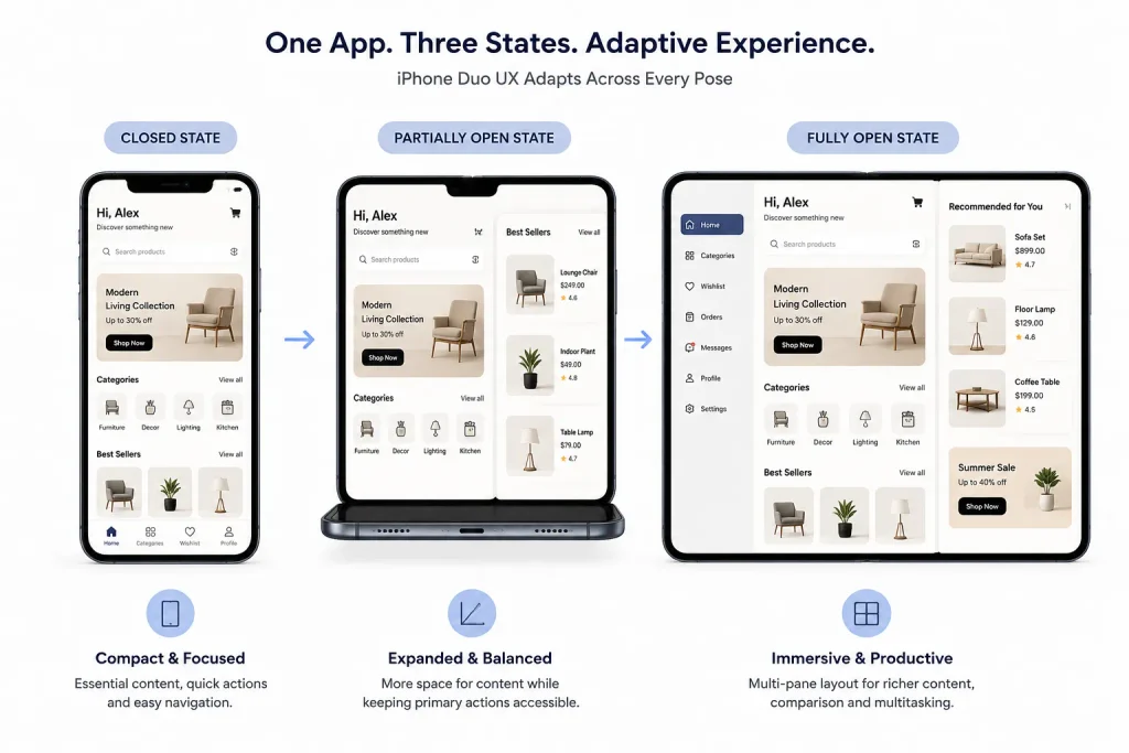
iPhone Duo introduces a different design condition. Its two displays and folding mechanism create multiple ways to view and interact with an app. Apple recommends using adaptable layouts rather than creating entirely separate designs for every device pose.
This makes iPhone Duo design less about creating more screens and more about managing available space intelligently.
For example, imagine a retail application. A closed state might prioritise product discovery and quick actions. When opened, the same application could provide product details beside recommendations, reviews, or comparison information. The business benefit comes from better information density without forcing users through unnecessary navigation steps.
The same principle applies to productivity, banking, education, travel, media, and professional applications. Each experience can use the larger canvas differently while keeping its core interaction model familiar.
Apple’s guidance also highlights different device poses, including open, closed, partially folded, and standing positions. That means businesses should evaluate the complete iOS app experience, rather than treating the inner display as simply a bigger phone screen.
iPhone Duo UX Design vs. Traditional iOS App Design
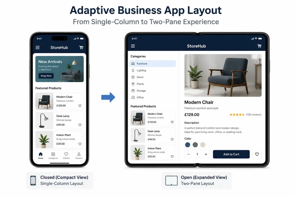
Traditional iOS UX design usually optimises a single interaction environment. Designers carefully position controls, content blocks, navigation, and actions within a defined screen. With iPhone Duo, the design needs to respond to changes in available space. Apple specifically recommends using size classes and standard components so layouts can resize naturally.
The key differences include:
| Traditional approach | iPhone Duo approach |
|---|---|
| Optimise for one primary screen | Adapt across display configurations |
| Fixed content hierarchy | Flexible content hierarchy |
| Single-pane experiences | Single or multi-pane experiences |
| Bottom or top controls | Context-aware control placement |
| Screen-specific thinking | Device-state thinking |
| Limited resizing scenarios | Continuous layout adaptation |
A conventional iPhone app design might place navigation and actions exactly where users expect them on a standard iPhone. iPhone Duo requires designers to reconsider those relationships when the available space changes.
The goal is not to redesign every component. Instead, teams should identify which elements need to move, resize, collapse, or expand. This approach also protects consistency. Users should not feel that they are entering a completely different application when they open the device.
Why Businesses Should Rethink Their iOS App Experience for iPhone Duo
The strongest reason to rethink the interface is not the hardware itself. It is the change in user behaviour that the hardware enables.
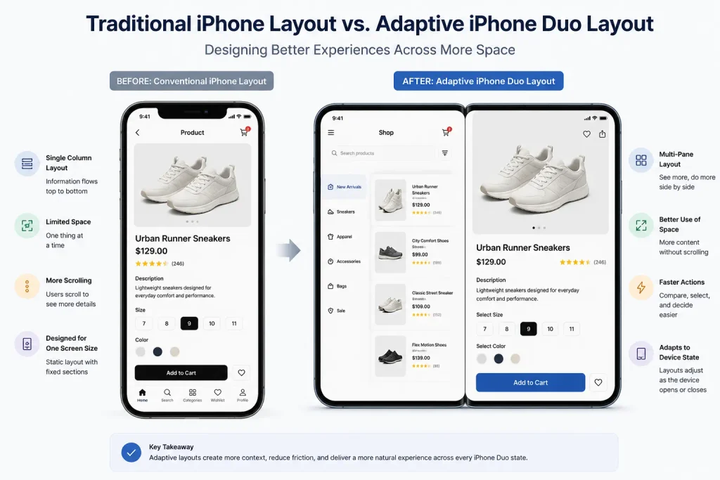
A larger inner display can support richer content, side-by-side information, multitasking, and more comfortable browsing. Apple’s implementation supports Split View and multiple windows, giving applications new opportunities for productivity.
For businesses, this can create several practical opportunities.
Improve information discovery
An eCommerce app could show product details beside images or comparisons. A travel app could display an itinerary alongside destination information.
Reduce unnecessary navigation
Users may not need to move between separate screens when related information can appear together. This can shorten task flows and make complex journeys easier to understand.
Support deeper workflows
Business applications can use the larger display for dashboards, forms, reports, editing tools, or document review.
Create more useful contextual experiences
A media application could prioritise content on the larger display while keeping controls accessible. A fitness application could show workout instructions alongside progress information. The important point is restraint. Businesses should not fill every available pixel with information.
Good responsive iOS app design uses additional space only when it improves comprehension or task completion.
Explore more: iPhone app planning for iPhone 18 Pro and iPhone Duo
Rethinking the iPhone Duo Interface: What UI Elements Need to Change?
The iPhone Duo interface requires designers to reconsider several familiar UI patterns.
1. Navigation and control placement
Apple has moved system navigation and controls toward the side in several iPhone Duo configurations to preserve vertical content space. Its guidance specifically discusses the positioning of toolbars and tab bars along the vertical axis. Applications should therefore test whether existing navigation patterns remain comfortable and discoverable.
For example, tab bars may need to adapt based on available width. Toolbars may also require different positioning when the device changes state.
2. Content hierarchy
A narrow display might show one primary content block. A wider display can introduce a secondary panel without overwhelming users. Designers should decide which content is essential and which content can expand when space becomes available.
3. Forms and data-heavy screens
Forms often expose weaknesses in fixed layouts. A larger display can allow related fields, instructions, and summaries to appear together. However, designers should avoid creating unnecessarily wide forms. Clear grouping remains more important than using every available area.
4. Touch targets and interactions
Changes in layout should never compromise touch interactions. Buttons and controls must remain easy to identify and operate across different poses. This is especially important when users hold the device differently after folding or opening it.
Applying Apple’s iOS Design Principles to iPhone Duo
Strong iOS UI design should remain grounded in familiar Apple patterns rather than introducing unnecessary novelty.
The Apple Human Interface Guidelines continue to provide the foundation for designing interfaces across Apple platforms. Apple’s current iPhone Duo guidance specifically states that standard iOS design patterns still apply.
Several principles deserve particular attention.
1. Build adaptive iOS layouts
Design around available space instead of creating independent interfaces for every possible device position. Apple recommends size classes and standard components for this purpose.
2. Follow established iOS navigation patterns
Users should not relearn navigation simply because the display changes. Preserve familiar relationships between content and controls whenever possible.
3. Prioritise accessibility
Accessibility in iOS apps should remain part of the design process from the beginning. Text sizing, contrast, control spacing, and VoiceOver support should work across layouts. Dynamic Type should allow text to remain readable without breaking the surrounding interface. Likewise, Dark Mode should remain consistent across expanded and compact layouts.
4. Consider device-specific UX
Device-specific UX does not mean creating unrelated experiences for every device. It means recognising where hardware characteristics genuinely affect interaction. For example, the hinge area and changing display boundaries can influence content placement. Apple advises designers to avoid placing important content where the fold could interfere with the experience.
5. Preserve familiarity
The best user experience design for iOS should feel familiar before it feels innovative. Users should understand what to do without studying the interface. Clear hierarchy, predictable controls, readable content, and consistent feedback remain essential.
Explore more: iOS app development cost guide
Should Businesses Redesign an Existing iOS App for iPhone Duo?
Not every application needs a complete redesign.
Businesses should first determine whether the existing iOS app design already responds well to changing screen sizes. Applications built with standard components and flexible layouts may require fewer changes. Apple notes that apps using standard system components and resizing support can adapt to iPhone Duo with relatively little adjustment.
A redesign becomes more valuable when the current app has fixed layouts, crowded navigation, rigid screen assumptions, or workflows that benefit from a larger display.
A practical assessment can follow four steps.
1. Audit existing screens
Identify screens that rely heavily on fixed dimensions or specific control positions.
2. Map important user journeys
Focus on actions that matter most to customers. These might include checkout, booking, account management, content creation, or reporting.
3. Identify opportunities for expansion
Determine where additional space could genuinely improve the task.
4. Test different device states
Test closed, open, rotated, and partially folded experiences. Apple recommends adapting layouts rather than creating extreme changes between poses. This approach reduces unnecessary redesign work while improving areas that directly affect the iPhone user experience.
Businesses should also consider mobile accessibility during this audit. A layout that looks attractive on a large display can still create problems for users with different accessibility needs. The result should be a personalised app experience that changes naturally with the device without feeling inconsistent.
How an iOS App Development Company Can Support iPhone Duo UX Design
The transition from design concept to production requires close coordination between UX designers and developers.
A capable iPhone app development company can begin by auditing the current application architecture, screen layouts, navigation patterns, and component usage.
The development team can then identify which screens can adapt automatically and which require dedicated design treatment.
This process should include prototype testing before implementation. Designers can test different layouts while developers validate whether those layouts behave correctly across device states.
The team should also test performance, accessibility, orientation changes, gestures, keyboard behaviour, and content scaling.
Businesses that already have an established product can take a phased approach. Start with high-value workflows, validate them with users, and then expand support to secondary screens.
This is where experienced iPhone App Developers can contribute practical value. They can translate adaptive design decisions into reusable components rather than building separate interfaces for every configuration.
The development process should also account for future iOS updates. Apple continues to evolve its design system, APIs, and device capabilities, so rigid implementation choices can increase maintenance work.
The broader goal is a seamless iOS experience across devices. Users should be able to open, close, rotate, or reposition the phone without losing context.
Conclusion
iPhone Duo creates an important shift in how businesses should approach mobile product design. The key opportunity is not simply having more screen space. It is using that space intelligently across different device states. A strong iPhone Duo UX Design strategy should adapt layouts, preserve familiar navigation, support accessibility, and expand workflows where additional space adds real value.
Businesses should avoid treating the device as another screen size. Instead, they should design an experience that responds naturally to how users hold and interact with the device. That mindset makes iOS app UX design more flexible and future-ready. It also creates a better foundation for products that need to serve users across changing Apple devices and interaction environments.